UX Design & Research @ Rooted
Helping novice plant owners nurture their plants and thrive through a habit tracker, AR scanner, and education
Full marks in the IN4MATX 132 course project at UCI

OVERVIEW
IN4MATX 132: Project in Human-Computer Interaction
January - March 2022
Team: Hannah Limary, Karla Avalos, Regina Tambunan, Kevin Tsai, Rohan Hemrajani
As a novice plant parent myself who’s killed her own fair share of succulents, Rooted is a much-needed support when it comes to plant parenthood. Rooted’s features — tracking, education, and identification — aim to help make the gardening process easier so plants may thrive.
My work focused on 4 key areas throughout the design process:
Developing an understanding of users’ needs, routines, and pain points by conducting interviews and secondary research
Creating the visual identity of Rooted, including logo, fonts, color schemes, and assets
Designing the app’s user flow, low-fidelity wireframes, and high-fidelity prototype
Seeking user feedback through usability testing
Click the prototype below or follow this button to interact!

Problem
Plant parenting is tough. The average plant parent has killed seven plants they’ve brought into their home.
70% of millennials call themselves a “plant parent”
40% of millennials plan to buy a houseplant this year
67% of those who do have plants say “plant parenthood” is tougher than they expected it to be
Sources: Article/OnePoll Survey — Deseret Article / NY Post Article / Survey Source
Problem Statement: How might we educate plant owners about their plants and how to care for them, in and around their home?
Solution
A one-stop plant care app that educates users on their plants’ needs, tracks plant care habits, sends care reminders, educates users with a plant encyclopedia, identifies plants using an AR scanner, and inspires future gardening through an Explore page.
Click to interact!
Competitive Analysis
Our group analyzed 6 direct and indirect competitors involved in care, education, and habit tracking. We looked at gardening apps such as PictureThis and Gardenia that assist in the care of both indoor and outdoor plants, other types of identification apps such as Dog Scanner and Shroomify, and some popular YouTube channels that offer experience-based advice for gardening and plant care. We selected our dimensions based on what we thought might be important to address in the problem space (specifically education, reminders, and habit tracking) as well as what features could enhance our design if we implemented them (such as advice/chatting/and social capabilities, journaling, and item identification)
By conducting our competitive analysis on apps in the same target space, we learned that a lot of apps had extra features users didn't want. This helped inform the features we included in our own prototype (to maintain external consistency, think of ways our solution could stand out from existing apps in the market, etc.). The knowledge we learned from this stage, combined with our own user interviews and key insights, influenced our ideation and prototyping over the next few weeks.
User Interviews
In order to fully understand the problem space, we conducted 12 user interviews to gain insight on what needs the potential users of our app would have, as well as understanding their current lifestyles and daily workflow with respect to how our app would fit within that.
Recruitment criteria:
People who are interested in becoming plant owners
People who consider themselves new to plant ownership (< 1 year of ownership)
People who consider themselves experienced plant owners
A mix of participants who keep indoor plants and participants who keep outdoor plants
Sample Questions from Interview Guide:
Would you walk me through a typical day at home for you? (Ex: lazy Sunday morning of chores/routine, this is usually when people may tend to their plants)
Tell us about your plant story. (Ex: history, current relationship)
What kinds of plants interest you and why? (Ex: indoor/outdoor)
What does plant care look like to you? (Ex: what components/tasks are needed)
How do you find out about the general information or needs of a plant?
Follow-up: Where do you go to find information about plant care?
Follow-up: Do you research their needs before you buy them, after you buy them, or both?
What are some challenges that come up when taking care of plants? This can be something you’ve experienced personally or observed from somewhere else.
If there was a tool to help you take better care of your plants, what would it look like to you?
Key Insights
Insight #1: Individuals use a variety of mediums to learn and understand how to better care for their plants.
90% of all interviewees use online resources such as YouTube, mobile apps, discussion forums, and graphics/diagrams to find plant care information.
Insight #2: Novice plant owners fixate their care attention on water and sunlight.
80% of novice plant owner interviewees describe plant care as just water and sunlight, whereas experienced plant owners consider more plant care aspects (soil pH, root care, and humidity). This indicates that novice plant owners could greatly benefit from plant care education.
Insight #3: Plant owners don't want to keep a strict schedule for plant care, but still want to be consistent.
Maintaining a care taking schedule and building good initial habits is difficult. Almost all participants described over- or under-watering as a key factor in the death of their plants. The majority of interviewees don’t currently follow a strict care schedule, but would benefit from routine reminders about plant care.
Personas
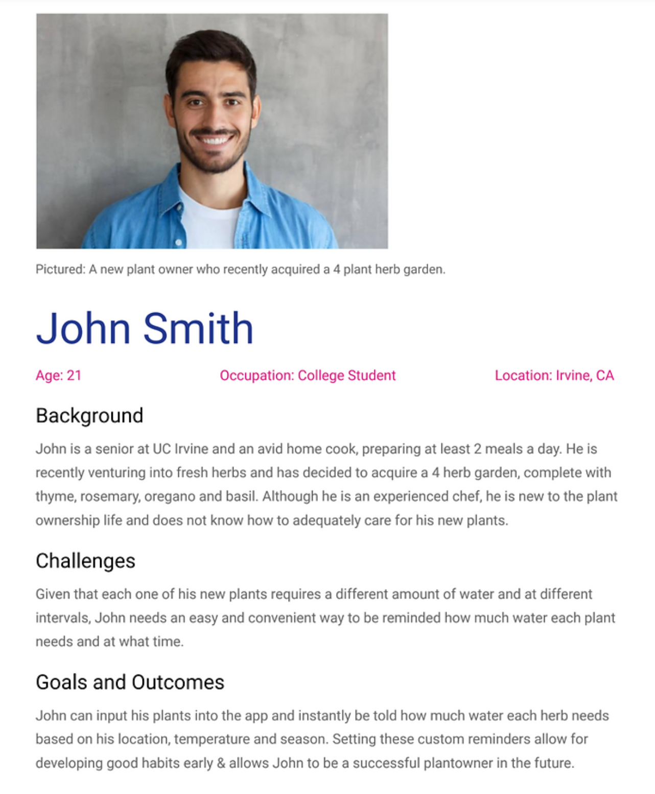
To better represent our insights through actionable means, we created personas of our target users: new plant owners who want basic help in gaining plant-related knowledge and supporting their care routines. This tool helped guide us by ensuring we addressed all requisite user needs and goals through the design of the app.
We also utilized storyboarding to better understand existing scenarios as well as test for future hypothetical ones regarding plant care and reminder feature usage.


Sketches


Visual Identity
Low-Fidelity Wireframes
High-Fidelity Prototype
Usability Testing
To evaluate our high-fidelity prototype, we created a usability testing process. This process was designed for an interviewer to walk a user through a series of 6 tasks, covering core functionality and usage cases of our app. We ended up conducting usability tests on 5 users from our target audience (new or interested plant owners).
Positive Insight #1: Reminder system is highly appreciated.
3/5 users mentioned that the reminder system was helpful. This verified our initial hypothesis that the reminders would be useful to new and interested plant owners.
Positive Insight #2: Scanning feature is convenient and of high value to these new plant owners.
3/5 users expressed praise for the convenience of the scanning feature, indicating that it relieved a key pain point for our target users.
Negative Insight #1: Hamburger menu caused confusion since it wasn’t utilized.
4/5 users commented about the hamburger menu, due to its lack of functionality during usability testing.
Negative Insight #2: Button contrast can be improved - locating buttons was difficult at times due to poor visibility.
Several participants mentioned that the color of buttons or other icons made it difficult to locate/recognize as clickable items.
Overall, users really liked the app's interface, with an average overall rating of 8.4/10. Next steps would include leveraging the insights we discovered during usability testing to improve our app's user experience.
Learnings
1. Narrow down problem spaces
When we initially thought of a gardening tracker app, we wanted to design an app that would cater to the needs of both novice and experienced plant owners. Due to our strict 10-week timeline as a class project, however, we scoped down to focus specifically on novice users. This allowed us to fully dive into our user research, design, and testing phases for our target group without compromising on quality.
2. Step up for teammates
In the thick of winter quarter classes, jobs, and extracurriculars, it can be easy for group members to get overwhelmed. When one of us had to prioritize other deadlines, we stepped up to cover all bases and finish milestones on time!
3. Next steps: There’s always more to do
With more time, Rooted would greatly benefit by catering to more advanced plant owners as well, building in features such as pest control tools and repotting guides. We would also like to refine our user research strategies and prototypes for a broader target audience, leverage usability testing insights to improve existing features, and conduct more extensive validation testing.


